
Tenlead Biotech APP
Tenlead Biotech APP
Tenlead Biotech APP
Design the exclusive app for Tealead member
Design the exclusive app for Tealead member
Design the exclusive app for Tealead member
June 2022 - January 2024
June 2022 - January 2024
June 2022 - January 2024
Duration
Duration
Duration
1y 6m
1y 6m
1y 6m
Company
Company
Company
Tenlead Biotech
Tenlead Biotech
Tenlead Biotech
Role
Role
Role
End to end UI/UX Designer
End to end UI/UX Designer
End to end UI/UX Designer
Background
Background
Background
Tenlead Biotech, a direct-selling company specializing in skincare products and health foods, aims to empower its members by providing a comprehensive mobile app. The new app will replace the old website, allowing members to manage all aspects of their business and purchases directly from their phones or tablets.
Tenlead Biotech, a direct-selling company specializing in skincare products and health foods, aims to empower its members by providing a comprehensive mobile app. The new app will replace the old website, allowing members to manage all aspects of their business and purchases directly from their phones or tablets.
Tenlead Biotech, a direct-selling company specializing in skincare products and health foods, aims to empower its members by providing a comprehensive mobile app. The new app will replace the old website, allowing members to manage all aspects of their business and purchases directly from their phones or tablets.
Responsibility
Responsibility
Responsibility
User Research
User Research
User Research
Ideation
Ideation
Ideation
Information architecture
Information architecture
Information architecture
User flow
User flow
User flow
Low/High-fi design
Low/High-fi design
Low/High-fi design
User testing
User testing
User testing
Final Outcome
Final Outcome
Final Outcome
47k+
47k+
Users
Users
2k+
2k+
Growth
Growth
Within 9 months of launch, the app gained over 47,000 users, with an average monthly growth of over 2,000 users.
Within 9 months of launch, the app gained over 47,000 users, with an average monthly growth of over 2,000 users.
Within 9 months of launch, the app gained over 47,000 users, with an average monthly growth of over 2,000 users.
User Feedback
User Feedback
Satisfaction: 8.0/10
Usability: 8.2/10
NPS (Net Promoter Score): 8.5/10
Satisfaction: 8.0/10
Usability: 8.2/10
NPS (Net Promoter Score): 8.5/10
Satisfaction: 8.0/10
Usability: 8.2/10
NPS (Net Promoter Score): 8.5/10

Challenges
Challenges
Challenges
Insufficient Information About Competing Products
Direct selling is a relatively closed industry. One often needs to become a member to see complete product content, limiting access to information about competitors.
Insufficient Information About Competing Products
Direct selling is a relatively closed industry. One often needs to become a member to see complete product content, limiting access to information about competitors.
Insufficient Information About Competing Products
Direct selling is a relatively closed industry. One often needs to become a member to see complete product content, limiting access to information about competitors.
Customer Habits
Although many users find the original website hard to use, they have become accustomed to its operation over the years, making it hard to change their habits.
Customer Habits
Although many users find the original website hard to use, they have become accustomed to its operation over the years, making it hard to change their habits.
Customer Habits
Although many users find the original website hard to use, they have become accustomed to its operation over the years, making it hard to change their habits.
Time limited
The tight project schedule limits the scope of work. Priority was given to addressing the most critical user needs, improving the current system's shortcomings, and adding the necessary functions.
Time limited
The tight project schedule limits the scope of work. Priority was given to addressing the most critical user needs, improving the current system's shortcomings, and adding the necessary functions.
Time limited
The tight project schedule limits the scope of work. Priority was given to addressing the most critical user needs, improving the current system's shortcomings, and adding the necessary functions.
Strategy
Strategy
Strategy

Understand
Understand
Understand

Define
Define
Define

Ideate
Ideate
Ideate

Test
Test
Test
Understand the Problems
Understand the Problems
Understand the Problems
In my interviews with 11 members, I found 4 main pain points:
In my interviews with 11 members, I found 4 main pain points:
In my interviews with 11 members, I found 4 main pain points:
Complicated Order Process
Complicated Order Process
Complicated Order Process
Overly complex and imprecise fields.Too many pages to navigate.
Overly complex and imprecise fields.Too many pages to navigate.
Overly complex and imprecise fields.Too many pages to navigate.
Inconvenient Organization Management
Inconvenient Organization Management
Inconvenient Organization Management
Troublesome querying of organizational information
Information visibility issues
Inaccessible previous performance data
Troublesome querying of organizational information
Information visibility issues
Inaccessible previous performance data
Troublesome querying of organizational information
Information visibility issues
Inaccessible previous performance data
Difficult Bonus Tracking
Difficult Bonus Tracking
Difficult Bonus Tracking
Bonuses are hard to find due to incorrect dates
Bonuses are hard to find due to incorrect dates
Bonuses are hard to find due to incorrect dates
Insufficient Functions and Low Usage
Insufficient Functions and Low Usage
Insufficient Functions and Low Usage
Many necessary functions missing
Users often handle tasks in person due to lack of functionality
Many necessary functions missing
Users often handle tasks in person due to lack of functionality
Many necessary functions missing
Users often handle tasks in person due to lack of functionality
Goal
Goal
Goal
Ensure a smooth transition from the old website to the new app while working within time and development constraints. We have prioritized the essential functions to design a Minimum Viable Product (MVP) based on identified pain points and current needs.
Ensure a smooth transition from the old website to the new app while working within time and development constraints. We have prioritized the essential functions to design a Minimum Viable Product (MVP) based on identified pain points and current needs.
Ensure a smooth transition from the old website to the new app while working within time and development constraints. We have prioritized the essential functions to design a Minimum Viable Product (MVP) based on identified pain points and current needs.
1
1
1
Seamless Transition
Seamless Transition
Seamless Transition
Allow members to switch effortlessly to the new app, encouraging them to prefer it over the old system.
Allow members to switch effortlessly to the new app, encouraging them to prefer it over the old system.
Allow members to switch effortlessly to the new app, encouraging them to prefer it over the old system.
2
2
2
Increase Usage Rate
Increase Usage Rate
Increase Usage Rate
Improve the app's usability to attract more users.
Improve the app's usability to attract more users.
Improve the app's usability to attract more users.
3
3
3
Simplify Processes
Simplify Processes
Simplify Processes
Streamline the ordering and organization inquiry processes, reduce unclear prompts, minimize user confusion, and improve overall user experience.
Streamline the ordering and organization inquiry processes, reduce unclear prompts, minimize user confusion, and improve overall user experience.
Streamline the ordering and organization inquiry processes, reduce unclear prompts, minimize user confusion, and improve overall user experience.
4
4
4
User-Centric Improvements
User-Centric Improvements
User-Centric Improvements
Enhance the interface and functionalities based on members' needs and pain points. Focus on real user needs rather than unnecessary features.
Enhance the interface and functionalities based on members' needs and pain points. Focus on real user needs rather than unnecessary features.
Enhance the interface and functionalities based on members' needs and pain points. Focus on real user needs rather than unnecessary features.
Wireframe
Wireframe
Wireframe
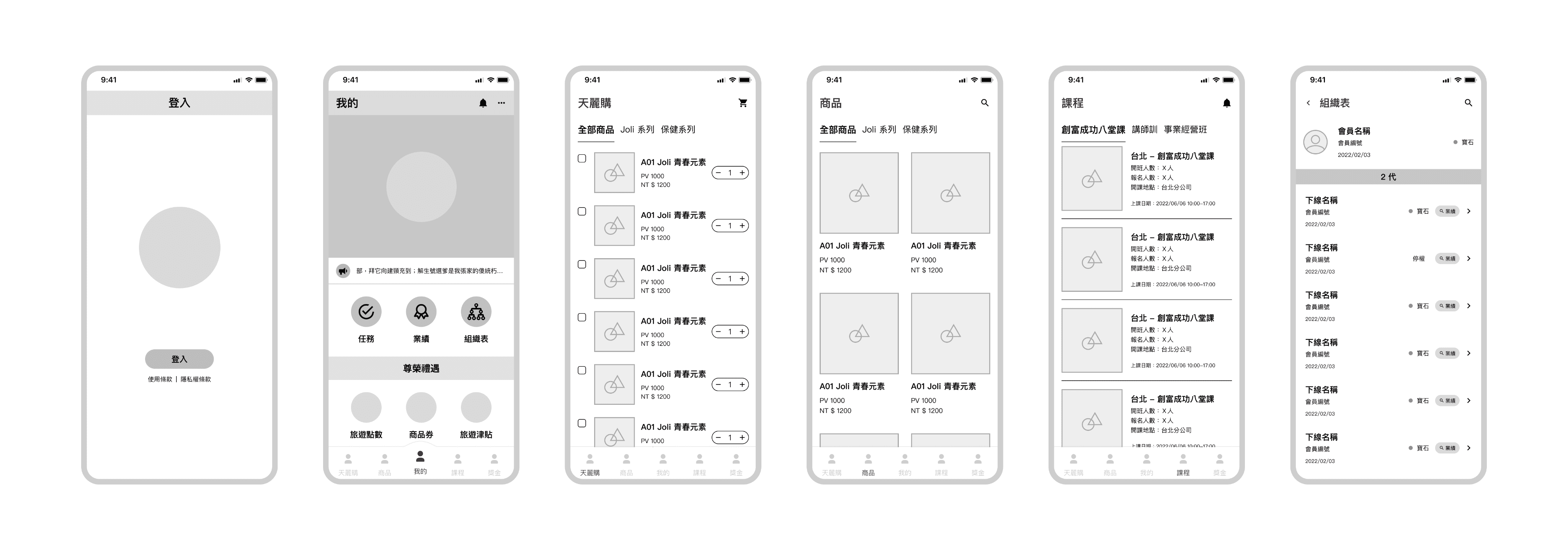
Test ideas with mockup and prototype
Test ideas with mockup and prototype
Test ideas with mockup and prototype
1 round test
1 round test
1 round test
11 Subjects
11 Subjects
11 Subjects
To meet the company's concerns and development constraints, 11 members were recruited for usability testing. I asked questions and observed their actions during the test, conducted one-on-one interviews, and had them fill out the SUS questionnaire. The results were used to classify usability issues and analyze key user pain points.
To meet the company's concerns and development constraints, 11 members were recruited for usability testing. I asked questions and observed their actions during the test, conducted one-on-one interviews, and had them fill out the SUS questionnaire. The results were used to classify usability issues and analyze key user pain points.
To meet the company's concerns and development constraints, 11 members were recruited for usability testing. I asked questions and observed their actions during the test, conducted one-on-one interviews, and had them fill out the SUS questionnaire. The results were used to classify usability issues and analyze key user pain points.
Task 1
Task 1
Place an order successfully and find the order progress.
Place an order successfully and find the order progress.
Task 2
Task 2
Successfully sign up for a course.
Successfully sign up for a course.
Task 3
Task 3
Find organization partners.
Find organization partners.
Goal
Goal
Goal
Identify app pain points and usability issues through user testing and feedback.
Improve app efficiency and effectiveness by optimizing design and functionality.
Increase user satisfaction by addressing needs and preferences.
Determine app usefulness and impact on the company's bottom line.
Identify app pain points and usability issues through user testing and feedback.
Improve app efficiency and effectiveness by optimizing design and functionality.
Increase user satisfaction by addressing needs and preferences.
Determine app usefulness and impact on the company's bottom line.
Identify app pain points and usability issues through user testing and feedback.
Improve app efficiency and effectiveness by optimizing design and functionality.
Increase user satisfaction by addressing needs and preferences.
Determine app usefulness and impact on the company's bottom line.

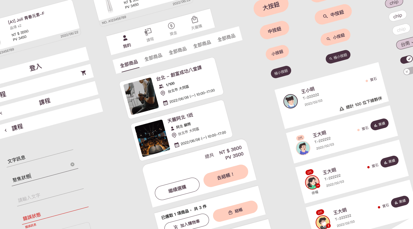
Features
Features
Features
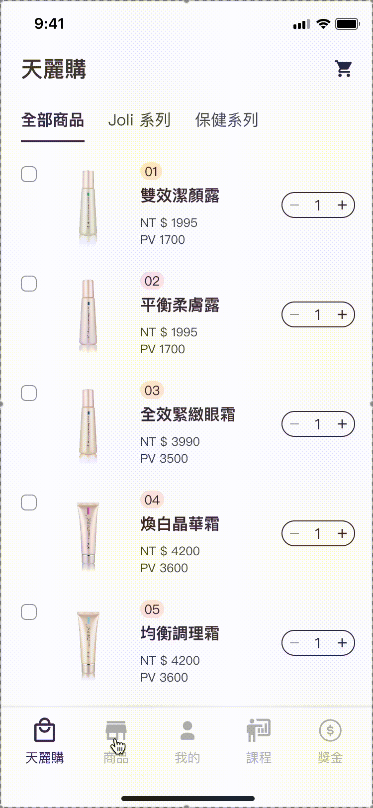
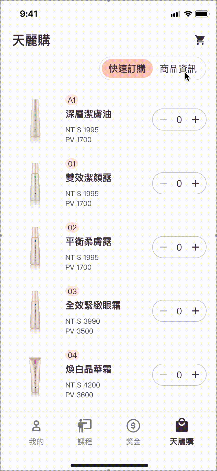
天麗購 Tianligo (Shop)
商品 Products
我的 Profile
課程 Course
獎金 Bonus
組織 Organization
業績 Performance
任務 Task
天麗購 Tianligo (Shop)
商品 Products
我的 Profile
課程 Course
獎金 Bonus
組織 Organization
業績 Performance
任務 Task
天麗購 Tianligo (Shop)
商品 Products
我的 Profile
課程 Course
獎金 Bonus
組織 Organization
業績 Performance
任務 Task
💡 Themes & Insights
💡 Themes & Insights
💡 Themes & Insights
1
1
1
Similarity between [Tianligo 天麗購] & [Products 產品]
Similarity between [Tianligo 天麗購] & [Products 產品]
Similarity between [Tianligo 天麗購] & [Products 產品]
The similarity between [Tianligo] and [Product] causes confusion when placing orders. Redesigning or renaming these elements can help distinguish them more clearly.
The similarity between [Tianligo] and [Product] causes confusion when placing orders. Redesigning or renaming these elements can help distinguish them more clearly.
The similarity between [Tianligo] and [Product] causes confusion when placing orders. Redesigning or renaming these elements can help distinguish them more clearly.
2
2
2
Confusion between [My Courses 我的課程] & [Courses 課程]
Confusion between [My Courses 我的課程] & [Courses 課程]
Confusion between [My Courses 我的課程] & [Courses 課程]
Users often mistakenly click on [My Courses] instead of [Courses] when signing up for a course. Simplifying and clarifying these labels could enhance user understanding and reduce navigation errors.
Users often mistakenly click on [My Courses] instead of [Courses] when signing up for a course. Simplifying and clarifying these labels could enhance user understanding and reduce navigation errors.
Users often mistakenly click on [My Courses] instead of [Courses] when signing up for a course. Simplifying and clarifying these labels could enhance user understanding and reduce navigation errors.
3
3
3
Hard to search and filter in [Organization 組織]
Hard to search and filter in [Organization 組織]
Hard to search and filter in [Organization 組織]
Users face challenges locating the search and filter functions within [Organization]. Redesigning these functions for better visibility and usability could improve the user experience.
Users face challenges locating the search and filter functions within [Organization]. Redesigning these functions for better visibility and usability could improve the user experience.
Users face challenges locating the search and filter functions within [Organization]. Redesigning these functions for better visibility and usability could improve the user experience.
4
4
4
Complexity of [Organization 組織] interface
Complexity of [Organization 組織] interface
Complexity of [Organization 組織] interface
The [Organization] page contains too many elements, making it hard for users to understand each one. Simplifying the layout and prioritizing essential elements could help users focus on key information.
The [Organization] page contains too many elements, making it hard for users to understand each one. Simplifying the layout and prioritizing essential elements could help users focus on key information.
The [Organization] page contains too many elements, making it hard for users to understand each one. Simplifying the layout and prioritizing essential elements could help users focus on key information.
SUS Score
SUS Score
SUS Score
85.68
85.68
85.68
The score shows that the subjects are highly satisfied with the app.
The score shows that the subjects are highly satisfied with the app.
The score shows that the subjects are highly satisfied with the app.
Finalize
Finalize
Finalize
The project results were modified after usability testing, and final discussions with the customer were conducted to address the main issues identified in the test results. Here are comparison images showing the before and after, along with the final design concept.
The project results were modified after usability testing, and final discussions with the customer were conducted to address the main issues identified in the test results. Here are comparison images showing the before and after, along with the final design concept.
The project results were modified after usability testing, and final discussions with the customer were conducted to address the main issues identified in the test results. Here are comparison images showing the before and after, along with the final design concept.
01
01
01
[Tianligo 天麗購] and [Products 商品] were merged into one feature.
[Tianligo 天麗購] and [Products 商品] were merged into one feature.
[Tianligo 天麗購] and [Products 商品] were merged into one feature.
Since the functions were too alike, [Tianligo] and [Products] were merged, using a switching method so members can quickly switch between the two functions, order swiftly, and view product information.
Since the functions were too alike, [Tianligo] and [Products] were merged, using a switching method so members can quickly switch between the two functions, order swiftly, and view product information.
Since the functions were too alike, [Tianligo] and [Products] were merged, using a switching method so members can quickly switch between the two functions, order swiftly, and view product information.
We also removed checkboxes and increased the visual size of the stepper for easier clicking
We also removed checkboxes and increased the visual size of the stepper for easier clicking
We also removed checkboxes and increased the visual size of the stepper for easier clicking
Before
Before
Before
After
After
After
02
02
02
Rename [My Courses 我的課程] to [Class Record 上課紀錄]
Rename [My Courses 我的課程] to [Class Record 上課紀錄]
Rename [My Courses 我的課程] to [Class Record 上課紀錄]
When signing up, members would subconsciously click [My Courses] instead of [Courses] due to similar naming. To reduce confusion, [My Courses] was renamed to [Class Record].
When signing up, members would subconsciously click [My Courses] instead of [Courses] due to similar naming. To reduce confusion, [My Courses] was renamed to [Class Record].

My courses
1
2
Courses
My courses
1
2
Courses
My courses
1
2
Courses
Before
Before
2
Class Records
1
Courses
Class Records
2
Class Records
1
Courses
Class Records
2
Class Records
1
Courses
Class Records
After
After
03
03
03
Redesign the [Course list] & Add the [Filter]
Redesign the [Course list] & Add the [Filter]
Redesign the [Course list] & Add the [Filter]
Complex text on the course list was replaced with icons.
Complex text on the course list was replaced with icons.
During testing, members reported too many courses, making it difficult to find the desired one. A new course filtering function was added for quicker filtering.
During testing, members reported too many courses, making it difficult to find the desired one. A new course filtering function was added for quicker filtering.

Before
Before

After
After
04
04
04
Hard to search and filter in [Organization 組織]
Hard to search and filter in [Organization 組織]
Hard to search and filter in [Organization 組織]
Subjects reported difficulty finding the hidden search and filter functions, and confusion with filtered category names. These functions were moved to a more prominent position on the first page for better visibility, and the Filter option now provides clearer category names.
Subjects reported difficulty finding the hidden search and filter functions, and confusion with filtered category names. These functions were moved to a more prominent position on the first page for better visibility, and the Filter option now provides clearer category names.

Before
Before
After
After
05
05
05
Complexity of [Organization 組織] interface
Complexity of [Organization 組織] interface
Complexity of [Organization 組織] interface
Based on user needs, some less important information like join date was removed from the organization view. The number of people and the performance button were relocated to prevent accidental clicks.
Based on user needs, some less important information like join date was removed from the organization view. The number of people and the performance button were relocated to prevent accidental clicks.
Based on user needs, some less important information like join date was removed from the organization view. The number of people and the performance button were relocated to prevent accidental clicks.

Before
Before
After
After
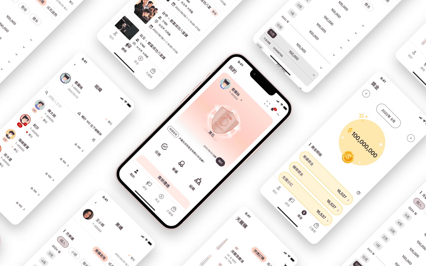
Final Version.
Final Version.
Final Version.

天麗生技
天麗生技
天麗生技
Tenlead Biotech
Tenlead Biotech
Tenlead Biotech


Features
Features
Features
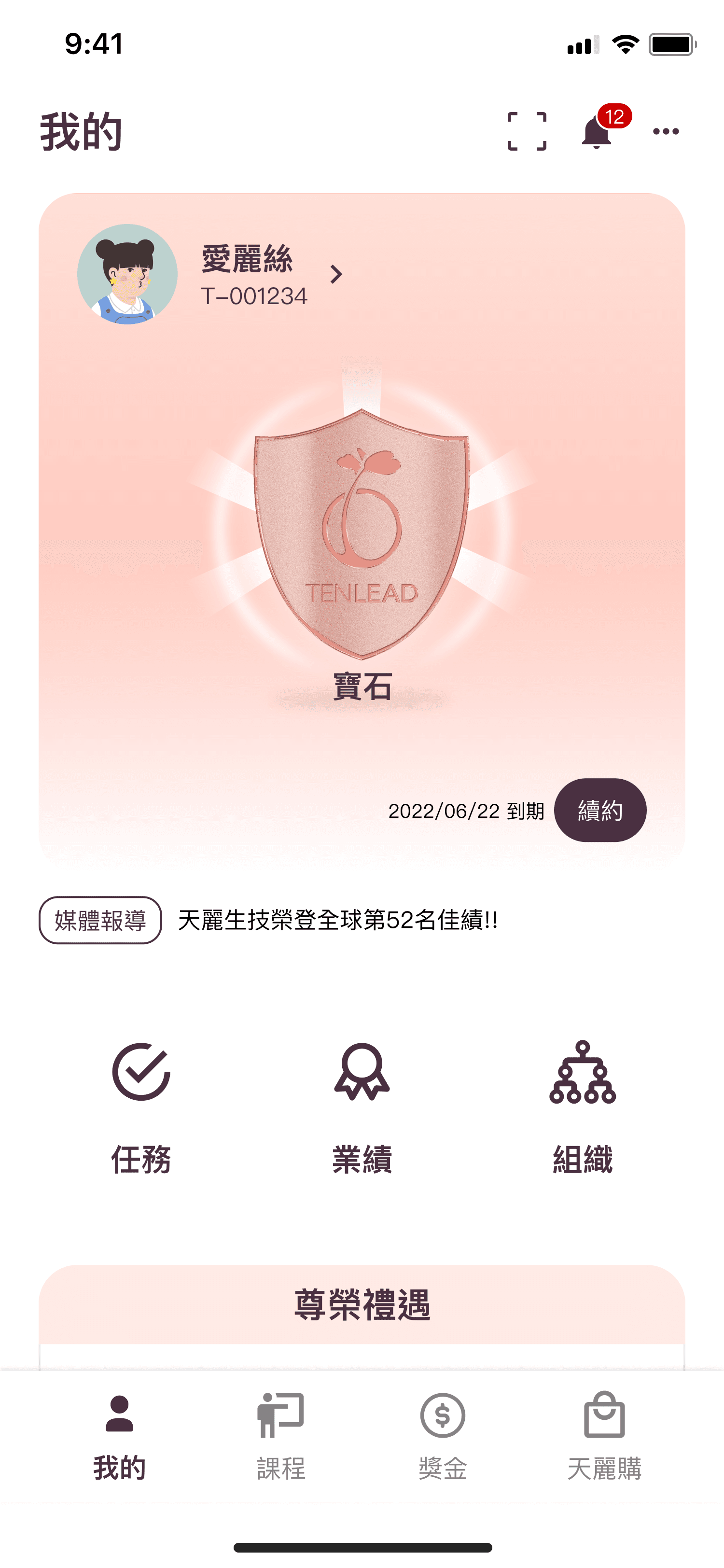
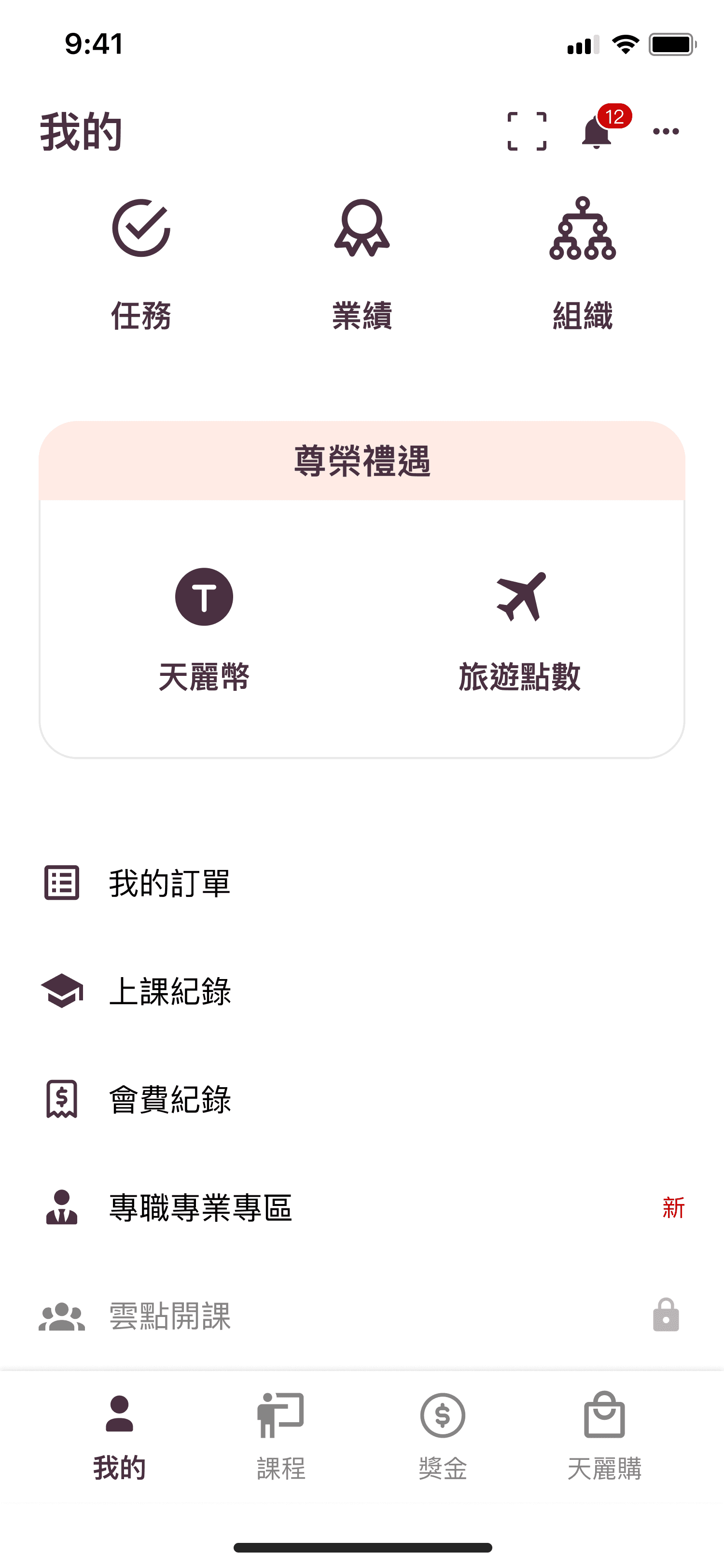
Profile
Profile
Profile
A personal hub with tasks, performance, and organization details. Members' levels are shown clearly to inspire pride and motivation. They can also display their levels for recruiting others.
A personal hub with tasks, performance, and organization details. Members' levels are shown clearly to inspire pride and motivation. They can also display their levels for recruiting others.
A personal hub with tasks, performance, and organization details. Members' levels are shown clearly to inspire pride and motivation. They can also display their levels for recruiting others.
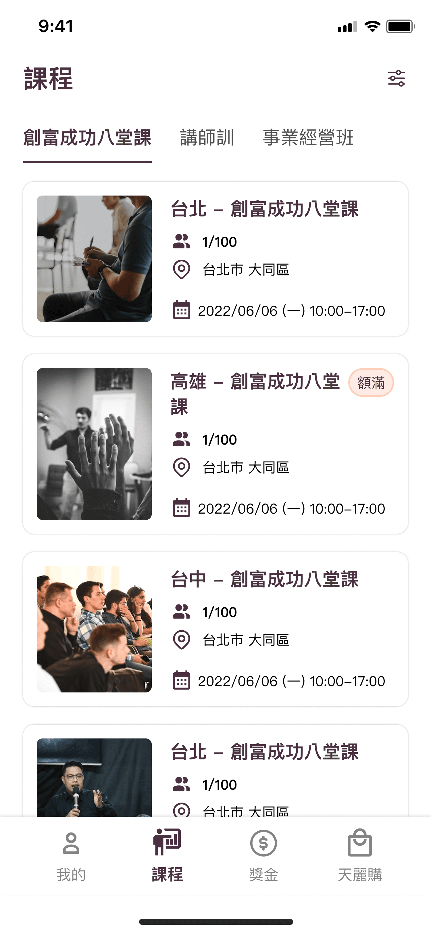
Course
Course
Course
It lets members easily browse and sign up for courses. Since members need to take classes for promotion, they can stay updated on new course offerings.
It lets members easily browse and sign up for courses. Since members need to take classes for promotion, they can stay updated on new course offerings.
It lets members easily browse and sign up for courses. Since members need to take classes for promotion, they can stay updated on new course offerings.

Bonus
Bonus
Bonus
A highly anticipated feature where members can view their monthly bonuses. Knowing their bonus amount is crucial as it motivates them to keep going.
A highly anticipated feature where members can view their monthly bonuses. Knowing their bonus amount is crucial as it motivates them to keep going.
A highly anticipated feature where members can view their monthly bonuses. Knowing their bonus amount is crucial as it motivates them to keep going.
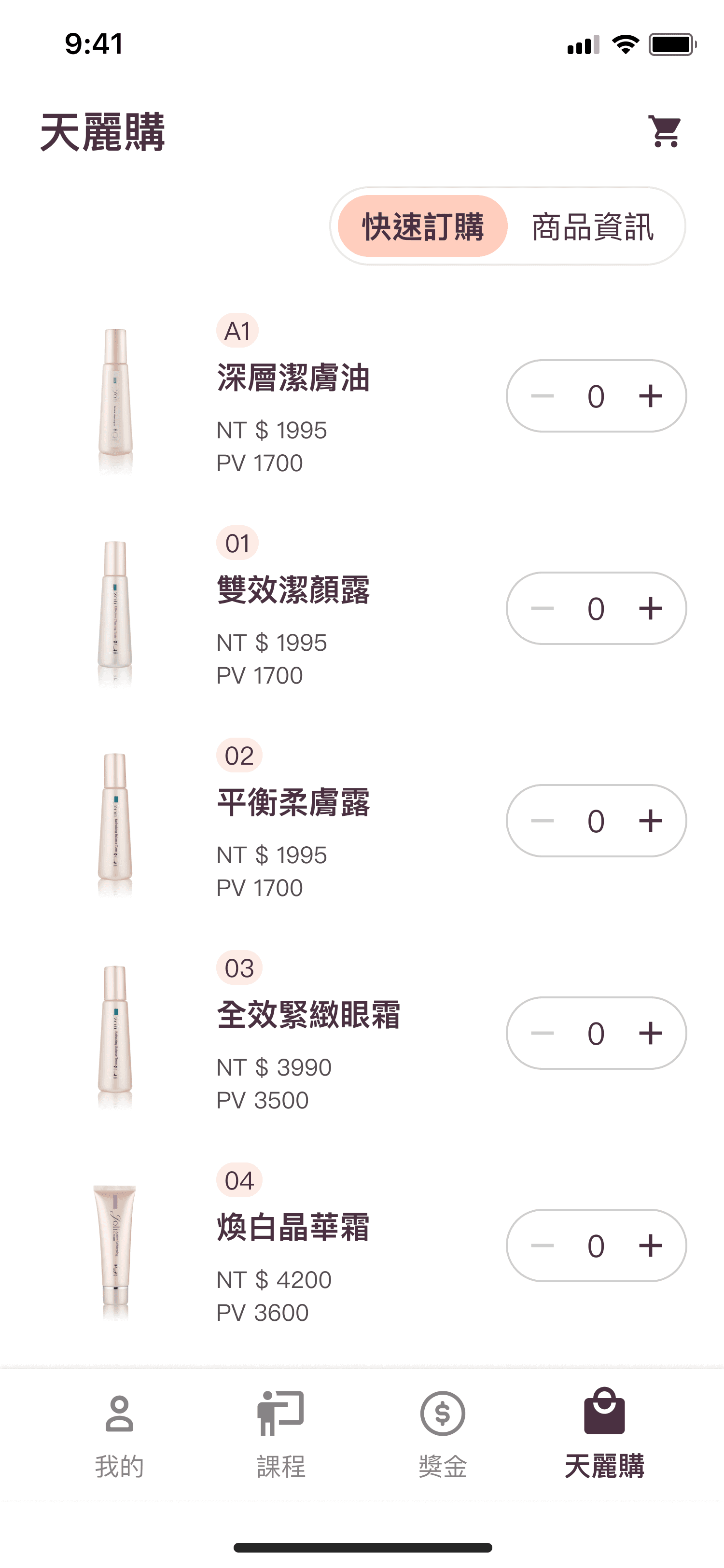
Tianligo
Tianligo
Tianligo
The second most-used function after [Profile]. This main feature in the direct-selling company allows members to buy products and earn PV (promotion points).
The second most-used function after [Profile]. This main feature in the direct-selling company allows members to buy products and earn PV (promotion points).
The second most-used function after [Profile]. This main feature in the direct-selling company allows members to buy products and earn PV (promotion points).
The bottom navigation features the most frequently used functions for easy access. [Profile] and [Tianligo] are the most used, hence their placement on the far left and right for thumb reach. The bottom navigation layout prioritizes the most essential functions for members' daily use and engagement with the app.
The bottom navigation features the most frequently used functions for easy access. [Profile] and [Tianligo] are the most used, hence their placement on the far left and right for thumb reach. The bottom navigation layout prioritizes the most essential functions for members' daily use and engagement with the app.
The bottom navigation features the most frequently used functions for easy access. [Profile] and [Tianligo] are the most used, hence their placement on the far left and right for thumb reach. The bottom navigation layout prioritizes the most essential functions for members' daily use and engagement with the app.
Cross-platform device
Cross-platform device
Cross-platform device

Since the target age group is relatively older, some members may require larger screens for better visibility and ease of use. Therefore, a tablet version has been designed to cater to those members who need it.
Since the target age group is relatively older, some members may require larger screens for better visibility and ease of use. Therefore, a tablet version has been designed to cater to those members who need it.
Design Principles
Design Principles
Design Principles
Consistent
Consistent
Consistent
Consistently designed components prevent user confusion. Each element has a distinct meaning and style, reducing the need for the engineering team to create manual components.
Consistently designed components prevent user confusion. Each element has a distinct meaning and style, reducing the need for the engineering team to create manual components.
Consistently designed components prevent user confusion. Each element has a distinct meaning and style, reducing the need for the engineering team to create manual components.
Easy understanding
Easy understanding
Easy understanding
Since older members may find it more challenging to use new software, we are dedicated to creating a simple and user-friendly design to ensure smooth operation.
Since older members may find it more challenging to use new software, we are dedicated to creating a simple and user-friendly design to ensure smooth operation.
Since older members may find it more challenging to use new software, we are dedicated to creating a simple and user-friendly design to ensure smooth operation.
Clear
Clear
Clear
The direct selling system has complex structures and unique processes. We spend extra time clarifying details and designing an interface that helps members understand everything clearly.
The direct selling system has complex structures and unique processes. We spend extra time clarifying details and designing an interface that helps members understand everything clearly.
The direct selling system has complex structures and unique processes. We spend extra time clarifying details and designing an interface that helps members understand everything clearly.
Results
Results
Results
It has been nine months since the launch, and the app has gained an impressive 38000 users. The usage rate is around 25%, with an average monthly growth of over 2,000 new users. Since the target age group is primarily 40-60 years old, there is a higher tendency to visit physical stores or seek assistance from others. The goal is to achieve a usage rate of over 50% for the app!
It has been nine months since the launch, and the app has gained an impressive 38000 users. The usage rate is around 25%, with an average monthly growth of over 2,000 new users. Since the target age group is primarily 40-60 years old, there is a higher tendency to visit physical stores or seek assistance from others. The goal is to achieve a usage rate of over 50% for the app!
It has been nine months since the launch, and the app has gained an impressive 38000 users. The usage rate is around 25%, with an average monthly growth of over 2,000 new users. Since the target age group is primarily 40-60 years old, there is a higher tendency to visit physical stores or seek assistance from others. The goal is to achieve a usage rate of over 50% for the app!
47K+
47K+
47K+
Users
Users
Users
25%
25%
25%
Usage Rate
Usage Rate
Usage Rate
2000+
2000+
2000+
Monthly Growth
Monthly Growth
Monthly
Growth
Survey
Survey
Survey
After the launch, a survey was conducted among 900 app users to gather feedback on the old system, the new app, experience with each function, overall satisfaction, ease of use, and Net Promoter Score (NPS).
After the launch, a survey was conducted among 900 app users to gather feedback on the old system, the new app, experience with each function, overall satisfaction, ease of use, and Net Promoter Score (NPS).
After the launch, a survey was conducted among 900 app users to gather feedback on the old system, the new app, experience with each function, overall satisfaction, ease of use, and Net Promoter Score (NPS).
8.0
8.0
8.0
Satisfaction
Satisfaction
Satisfaction
8.2
8.2
8.2
Usability
Usability
Usability
8.5
8.5
8.5
NPS
NPS
NPS
Comparison between App and Old System
Comparison between App and Old System
Comparison between App and Old System
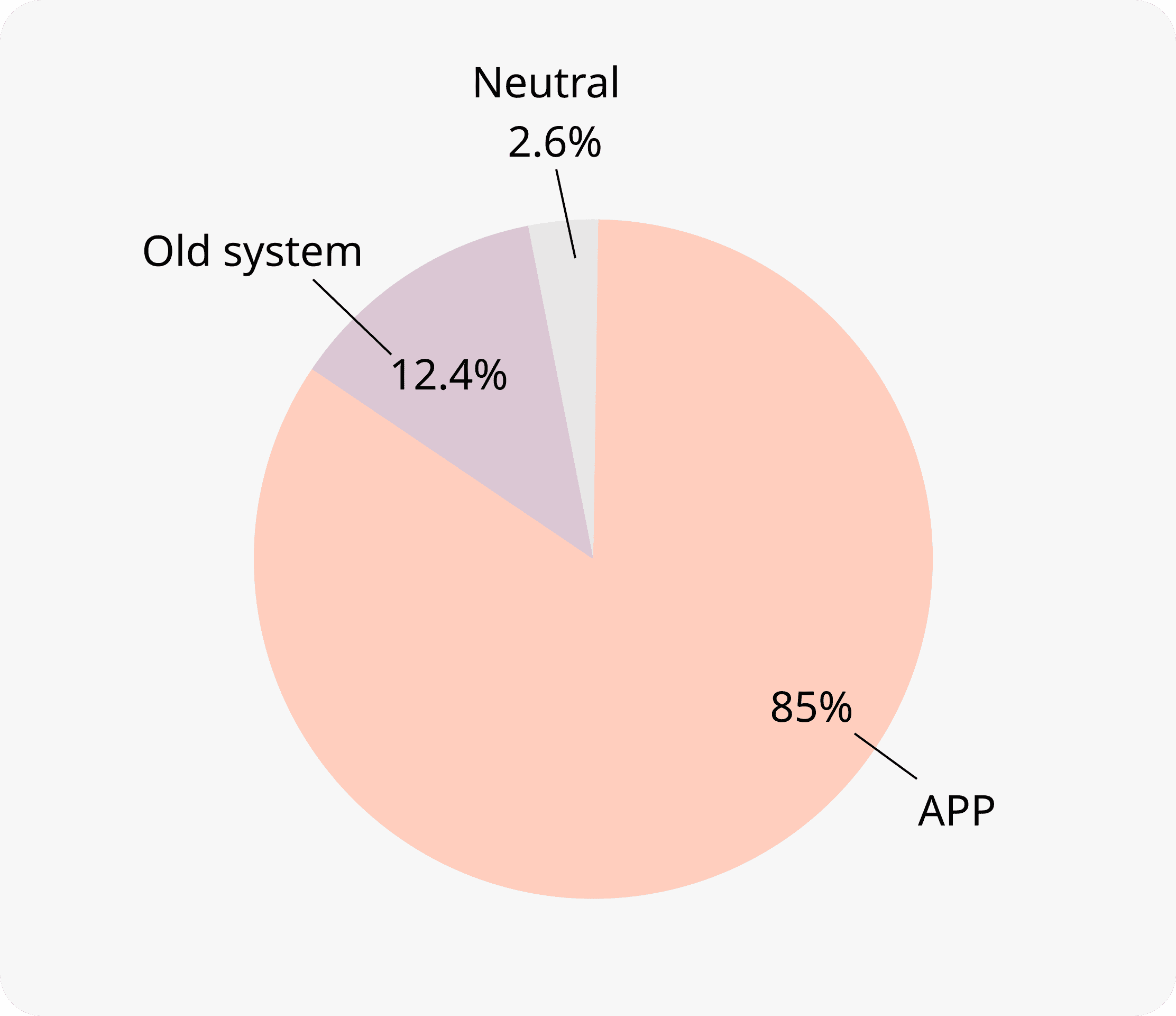
There are 555 app users in the survey who had used both the app and the old system. The survey results show that 85% of users prefer the new app, mainly for most functions.
There are 555 app users in the survey who had used both the app and the old system. The survey results show that 85% of users prefer the new app, mainly for most functions.
There are 555 app users in the survey who had used both the app and the old system. The survey results show that 85% of users prefer the new app, mainly for most functions.

However, some users still prefer the old website for performance, organization, and bonuses, finding the larger screen and click areas more convenient. To address this, efforts will be made to provide a more convenient experience for members to use the app. Notably, none of the issues identified during pre-launch usability testing were raised, indicating that the modified version before launch has improved the user experience.
However, some users still prefer the old website for performance, organization, and bonuses, finding the larger screen and click areas more convenient. To address this, efforts will be made to provide a more convenient experience for members to use the app. Notably, none of the issues identified during pre-launch usability testing were raised, indicating that the modified version before launch has improved the user experience.
However, some users still prefer the old website for performance, organization, and bonuses, finding the larger screen and click areas more convenient. To address this, efforts will be made to provide a more convenient experience for members to use the app. Notably, none of the issues identified during pre-launch usability testing were raised, indicating that the modified version before launch has improved the user experience.
“It works great, keep using it.”
“It works great, keep using it.”
“It works great, keep using it.”
“The layout is clear, but the shipping progress needs improvement.”
“The layout is clear, but the shipping progress needs improvement.”
“The layout is clear, but the shipping progress needs improvement.”
"The design of this app is very good. It allows us to clearly understand the business performance, monthly bonus, and check the progress of organization partners. It's super great, and I like it very much."
"The design of this app is very good. It allows us to clearly understand the business performance, monthly bonus, and check the progress of organization partners. It's super great, and I like it very much."
"The design of this app is very good. It allows us to clearly understand the business performance, monthly bonus, and check the progress of organization partners. It's super great, and I like it very much."
Next steps
Next steps
Next steps
Analyze the monthly observation data results.
Plan and conduct user interviews.
Analyze user pain points based on the results from data analysis and interviews.
Conduct A/B testing to validate potential improvements.
Analyze the monthly observation data results.
Plan and conduct user interviews.
Analyze user pain points based on the results from data analysis and interviews.
Conduct A/B testing to validate potential improvements.
Analyze the monthly observation data results.
Plan and conduct user interviews.
Analyze user pain points based on the results from data analysis and interviews.
Conduct A/B testing to validate potential improvements.
Future plan
Future plan
Future plan
Update the app's style and corporate color scheme in accordance with changes to the company's product and logo design.
As the company expands its overseas business, add support for multiple languages and ensure compliance with international standards.
Update the app's style and corporate color scheme in accordance with changes to the company's product and logo design.
As the company expands its overseas business, add support for multiple languages and ensure compliance with international standards.
Update the app's style and corporate color scheme in accordance with changes to the company's product and logo design.
As the company expands its overseas business, add support for multiple languages and ensure compliance with international standards.
Learning and takeaway
Learning and takeaway
Learning and takeaway
Hands-on Experience with a Complete Project Lifecycle
Hands-on Experience with a Complete Project Lifecycle
Hands-on Experience with a Complete Project Lifecycle
I participated in the entire process, from requirement gathering, information architecture planning, user flow design, wireframing, usability testing, UI design, to development. This experience gave me a holistic understanding of the effort and cost involved in developing a project from scratch.
I participated in the entire process, from requirement gathering, information architecture planning, user flow design, wireframing, usability testing, UI design, to development. This experience gave me a holistic understanding of the effort and cost involved in developing a project from scratch.
I participated in the entire process, from requirement gathering, information architecture planning, user flow design, wireframing, usability testing, UI design, to development. This experience gave me a holistic understanding of the effort and cost involved in developing a project from scratch.
Driving UX Within the Organization
Driving UX Within the Organization
Driving UX Within the Organization
Conducting mid-project usability testing to identify user insights before development, avoiding potential misalignment after launch.
Setting up Google Analytics post-launch to track and analyze user behavior, enabling data-driven improvements.
Designing and distributing user surveys to gather direct feedback.
Lessons Learned
Lessons Learned
Lessons Learned
Recognizing that none of the stakeholders truly represent the end-users, and user research is crucial to uncover their actual needs and pain points.
Balancing the requirements of multiple parties - users, customers, developers, and project constraints - to design a solution that works best for everyone.
Understanding that while user needs are important, customers ultimately fund the project, so their perspectives must also be considered during the design process.